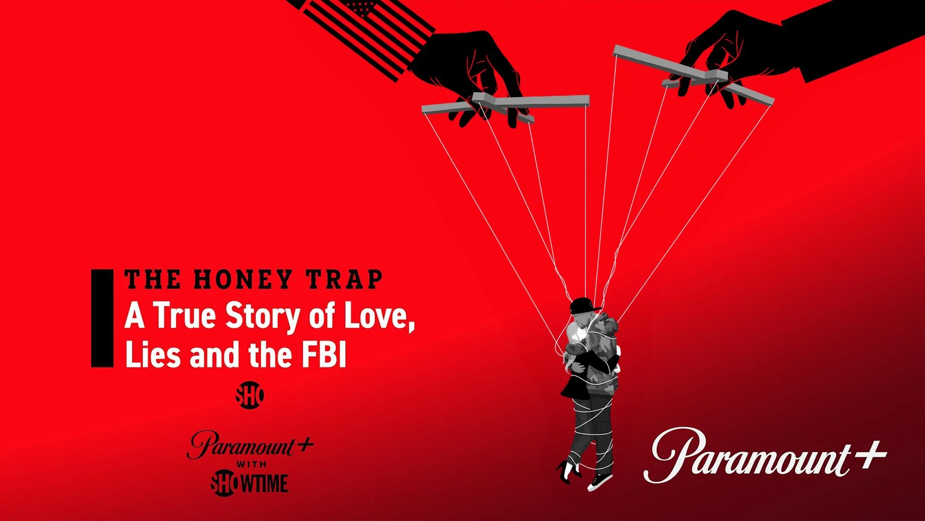
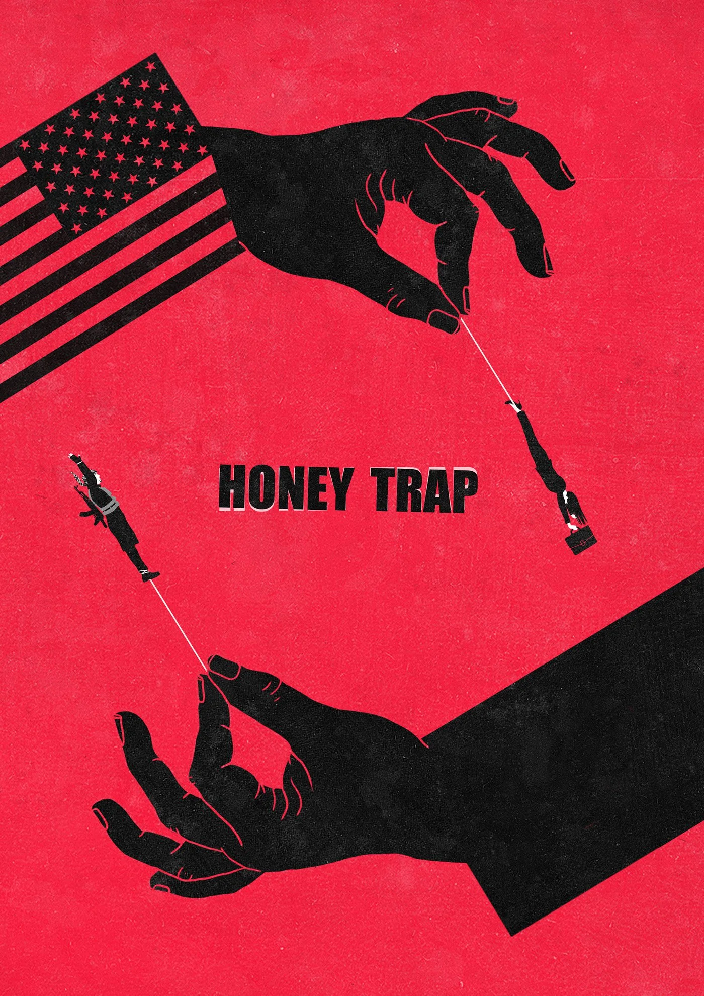
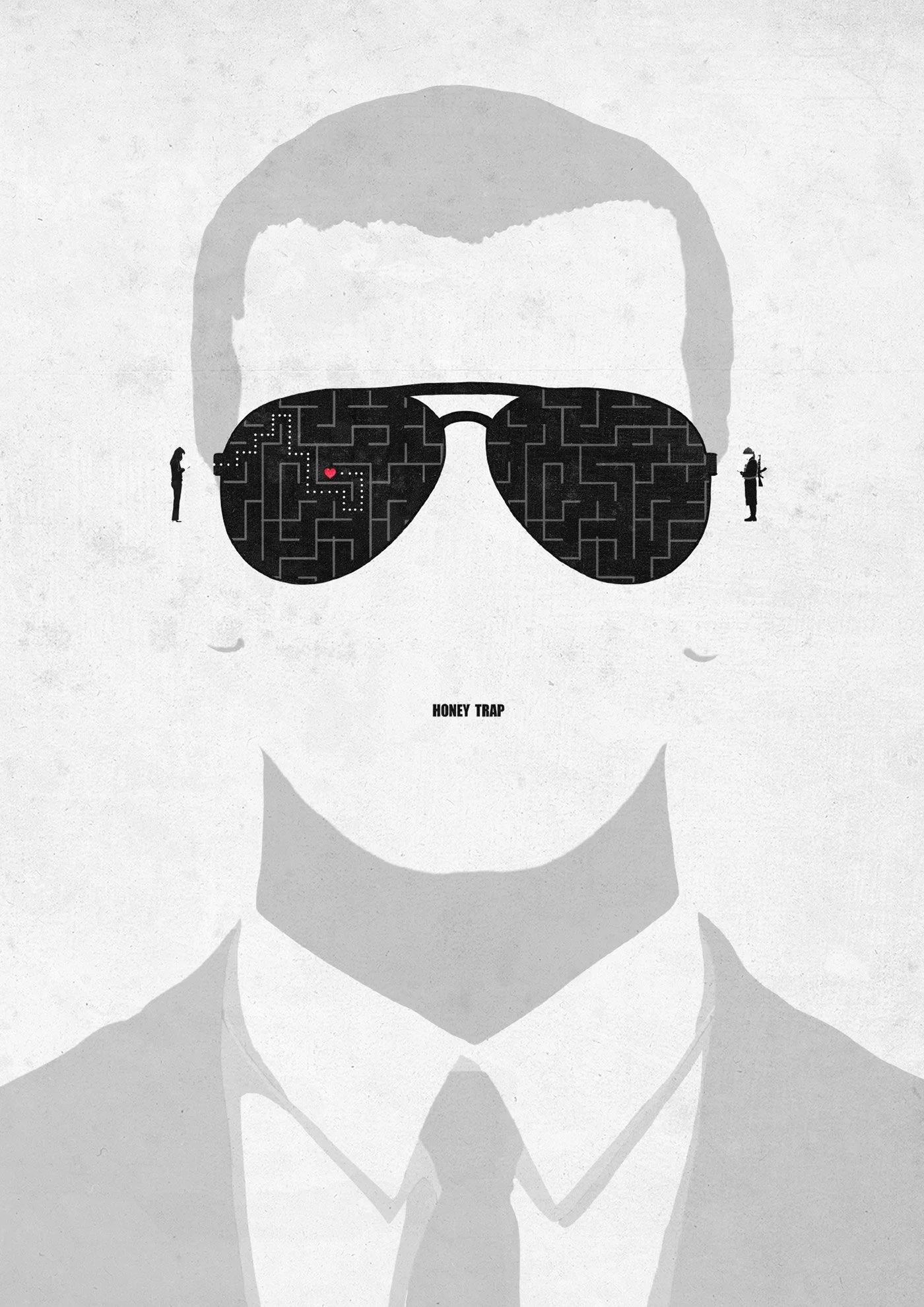
Paramount+ — “The Honey Trap” Key Art
A commissioned key artwork for The Honey Trap, a 2024 Paramount+ Original documentary directed by Chris Moukarbel (Gaga: Five Foot Two, Me at the Zoo). The film tells the true story of Denis Cuspert—better known as Deso Dogg—a German rapper who was radicalized online and drawn into the ranks of ISIS. At the heart of the story is an American FBI agent who falls in love with him—a dramatic tale of love, manipulation, radicalization, and betrayal.
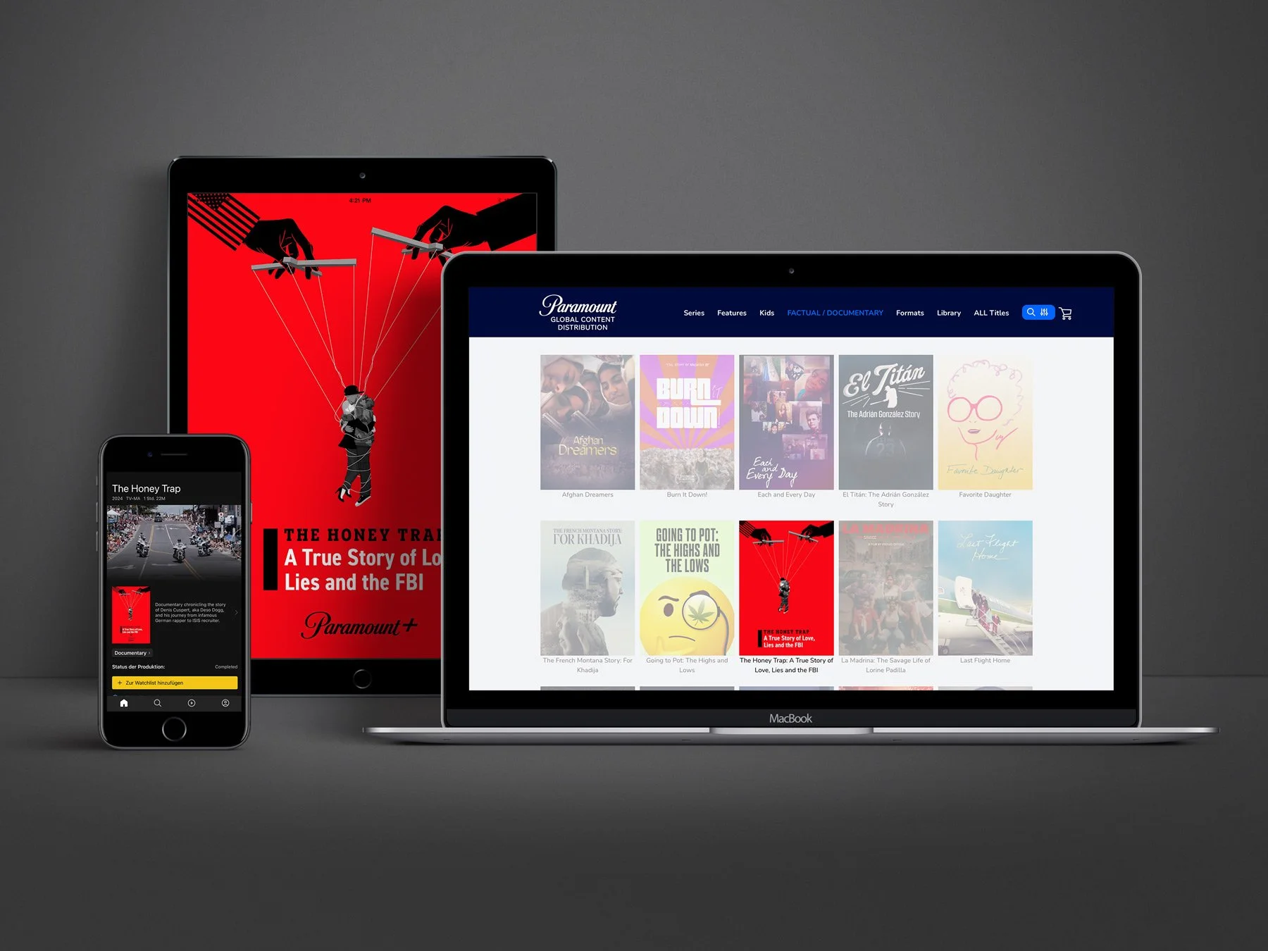
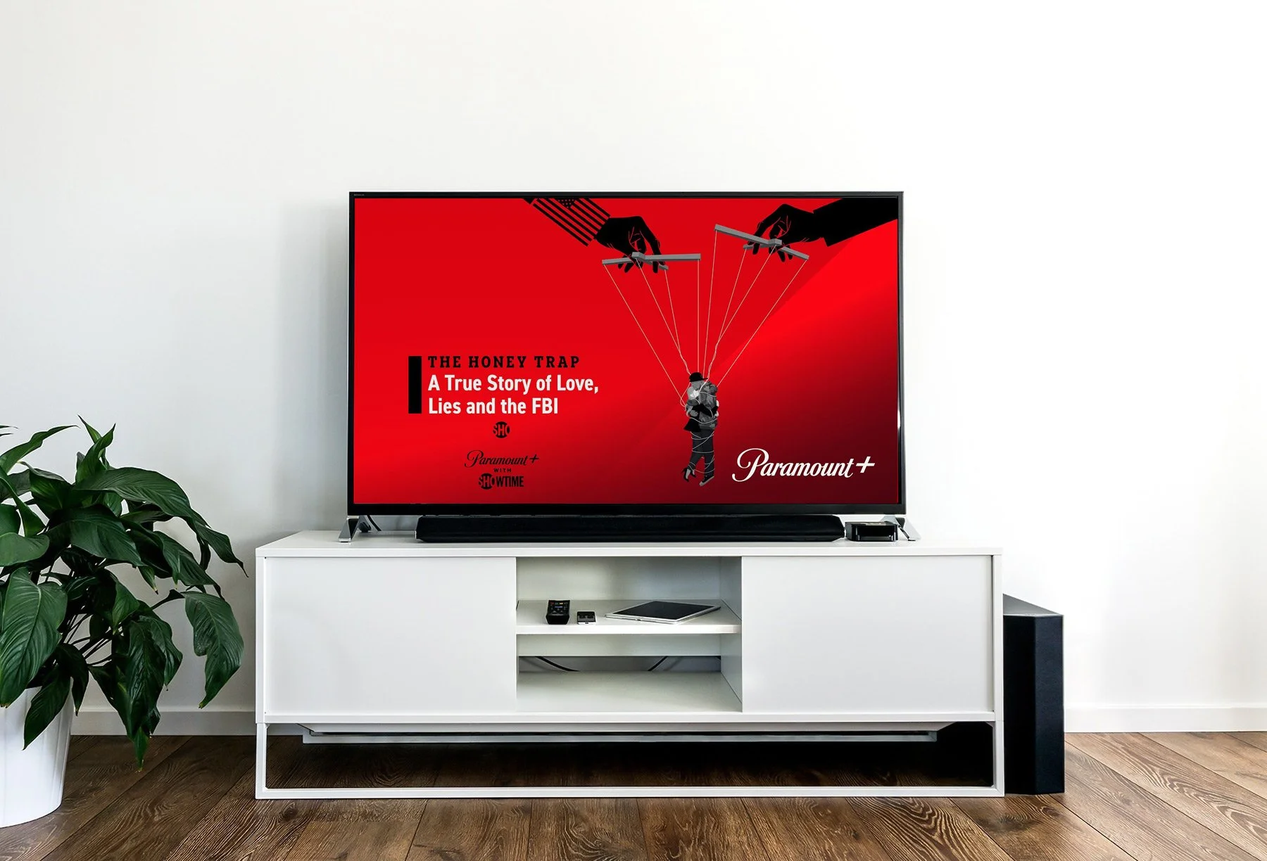
The developed illustration was used by Paramount+ as the official key artwork—across streaming platform covers, social media channels, and as the official poster for festivals and promotional campaigns.
The stylistic direction was conceptual, minimalist, and high-impact—inspired by classic espionage poster design, but translated into a clean, contemporary visual language. Strong contrasts, minimal elements, and thought-provoking composition were used to capture the essence of the film: seduction, danger, ideology, and manipulation.
Client: Paramount+ | Year: 2024
CREDITS:
Robert Postotnik – Vice President of Key Art Design
Peter Gatto – Creative Director & Brand Strategist
Ross Jeffcoat – Senior Director & Design Production
Michelle Lee – Associate Creative Director
Final Key Artwork:
In Usage Across Platforms:
Details:
A look behind the process
This project offered the perfect opportunity to document and share my entire creation process—from early sketches and exploratory ideas to adjustments, iterations, and the final key artwork.
Thematically, The Honey Trap tapped straight into my creative home—with topics of love, danger, violence, radicalization, hip hop, and psychological traps—themes that often run through my personal Mindshots series.
Rarely has a project sparked so many visual ideas from the first briefing. This was thanks to the perfect balance of the client briefing: clear and well-framed, offering just the right amount of creative freedom and constraints to keep the core vision focused while allowing for bold conceptual thinking.
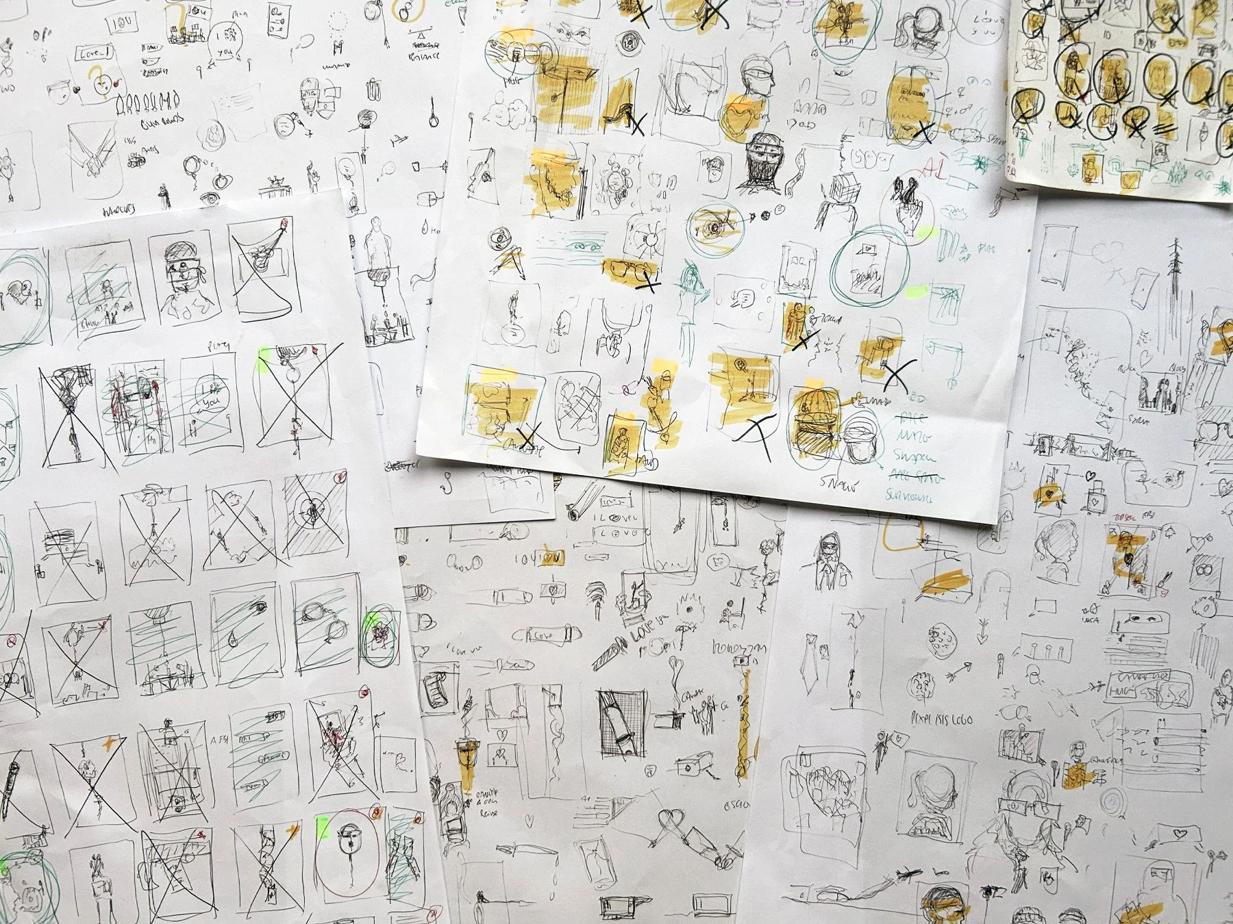
Step 1: Gathering Ideas
At this early stage, my thinking is fast, intuitive, and raw—just like the sketches. What looks like chaos is actually a reflection of my internal process: rough thoughts, associations, symbols and fragments rushing and captured on paper.
I never use a sketchbook here—only loose sheets. It allows me to spread them out on a large table and get a full bird’s-eye view during the evaluation phase. This setup encourages serendipity: unexpected connections appear between scattered elements, helping me discover ideas I wouldn’t see in a linear flow.
The entire sketching phase spanned about a week, with intentional pauses in between for incubation. Stepping back, letting ideas settle, and returning with fresh eyes is a crucial part of the process.
Step 2: Exploring Conceptual Directions
At this point, I begin refining selected ideas, bringing them as close as possible to the intended final look—especially in terms of how the minimal color palette will work together.
During this phase, several visual approaches naturally evolved, each offering a different angle on the story. These were:
Direction A: A Twisted Love Story
Direction B: The Honey Trap
Direction C: Traitors for Love
Direction D: A Game of Espionage
Black Editions
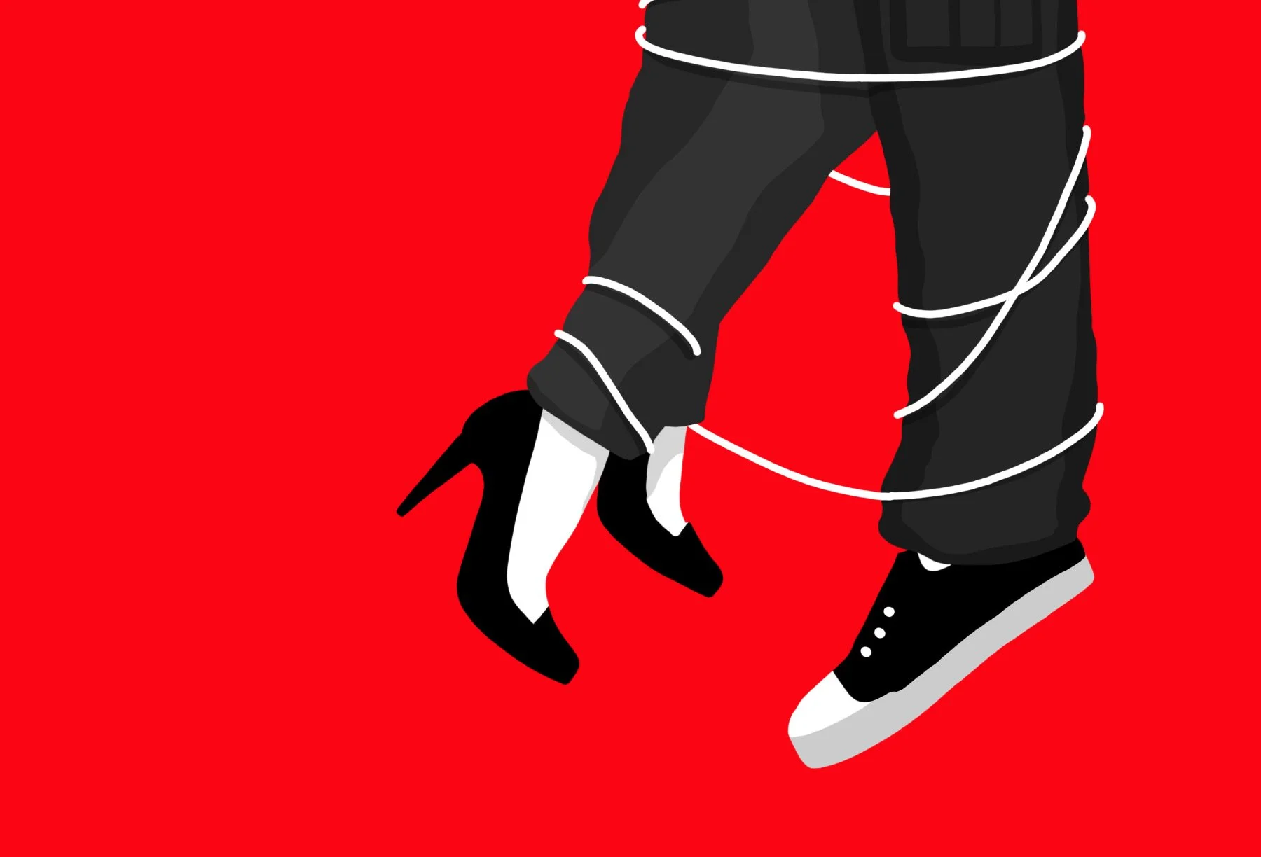
A) A Twisted Love Story
In this direction, the couple becomes tangled in major forces—both external and of their own making. Drawn into a brutal world through their own choices, they now dangle between opposing powers, trapped in a dangerous web of loyalty, love, and ideology.
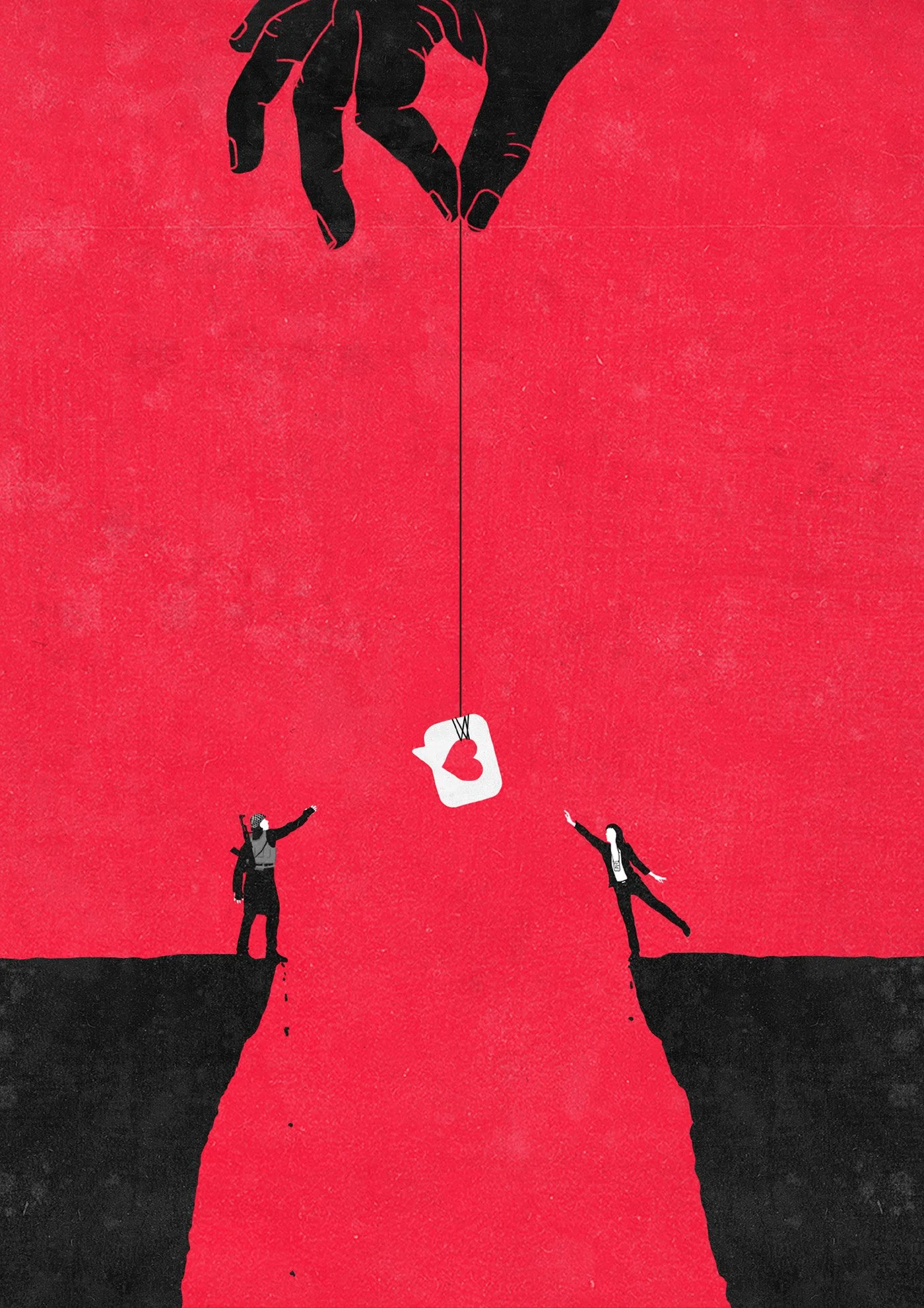
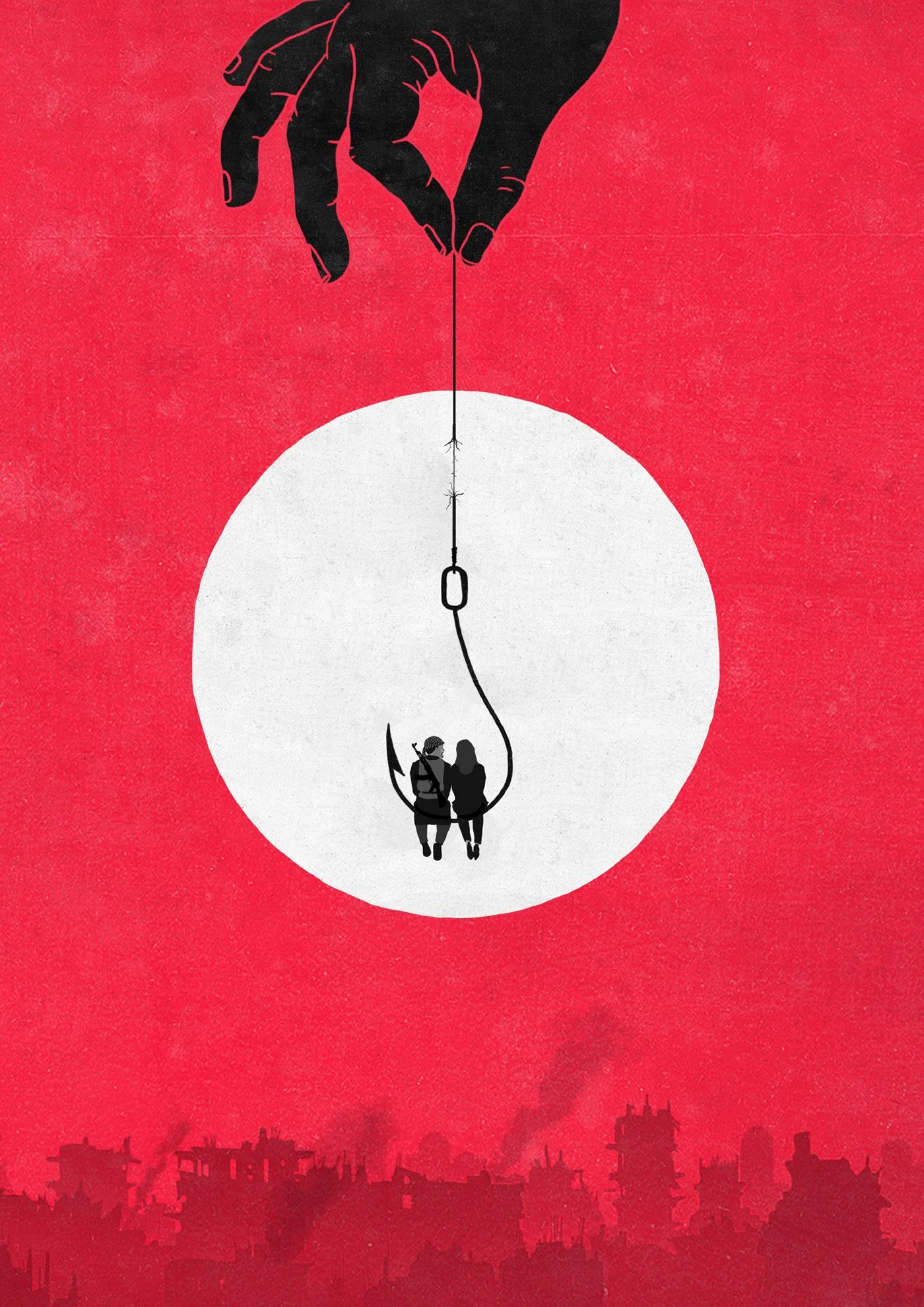
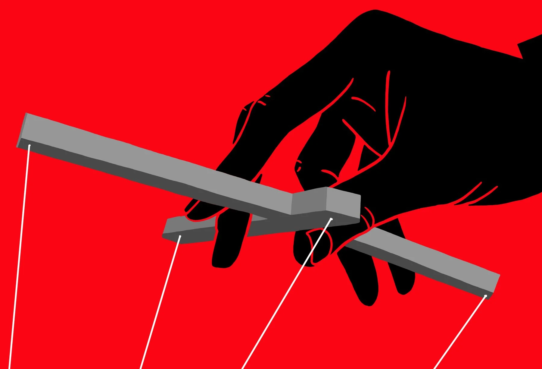
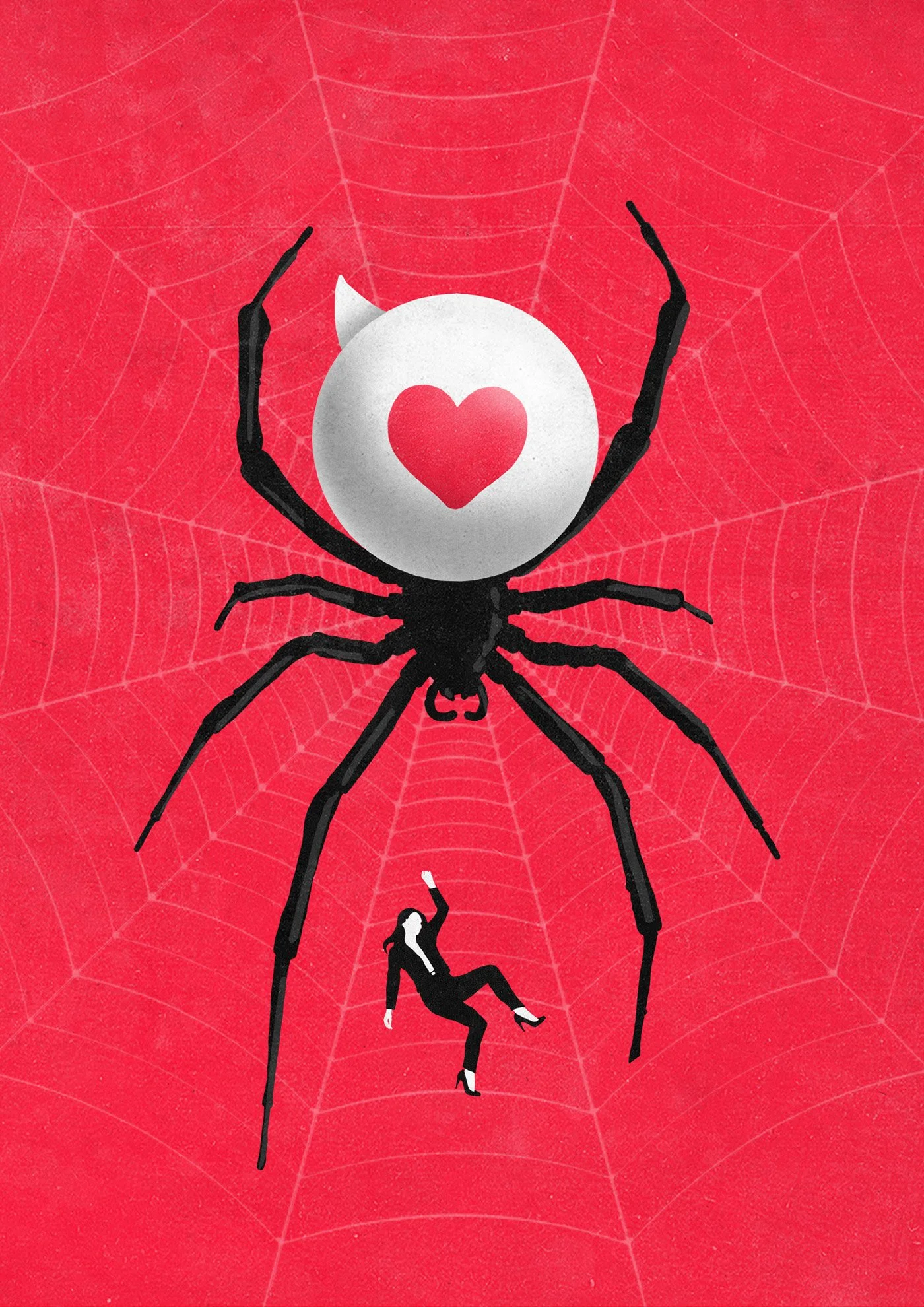
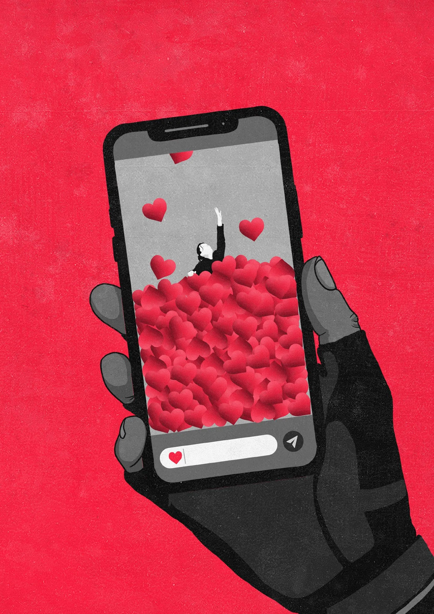
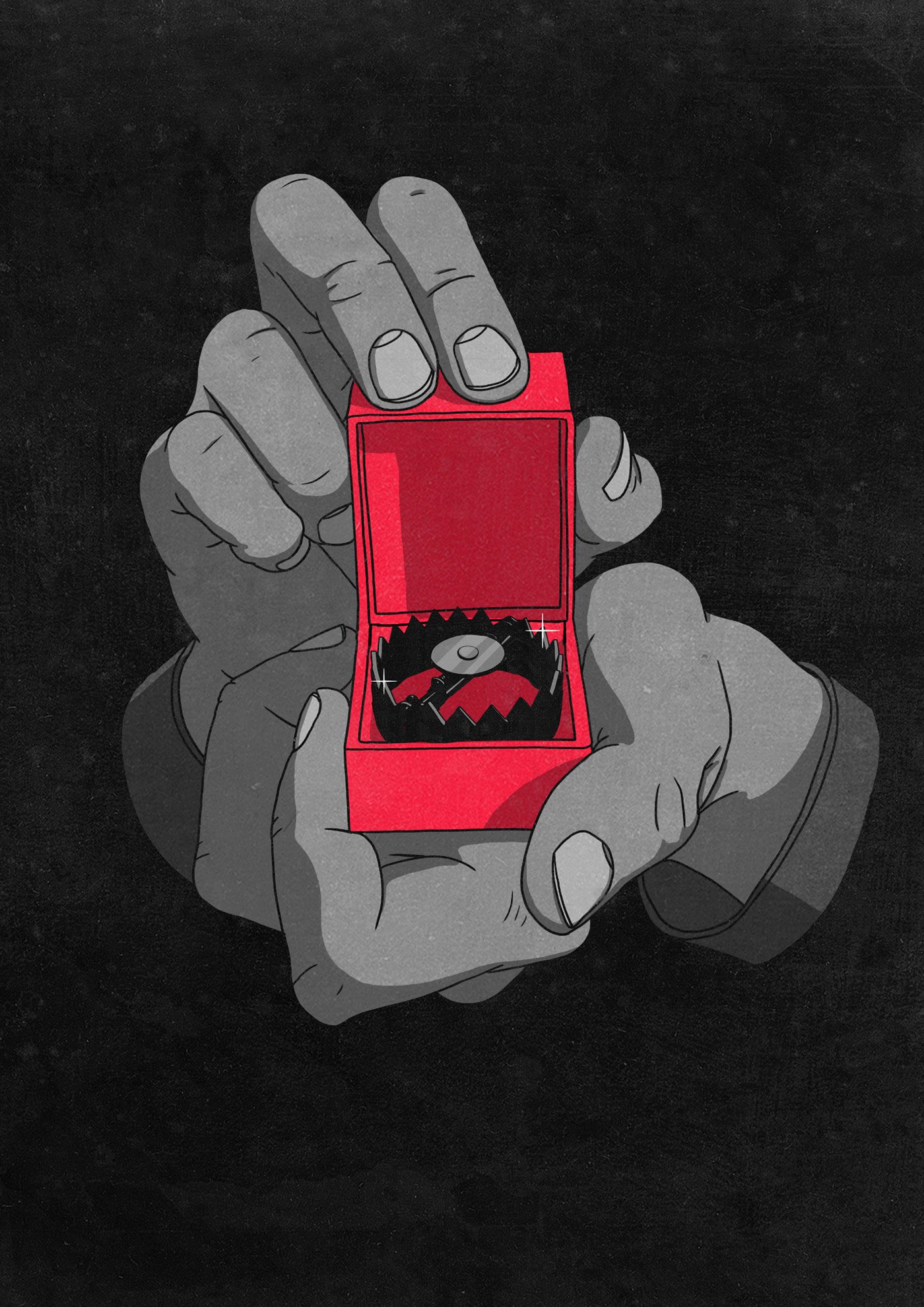
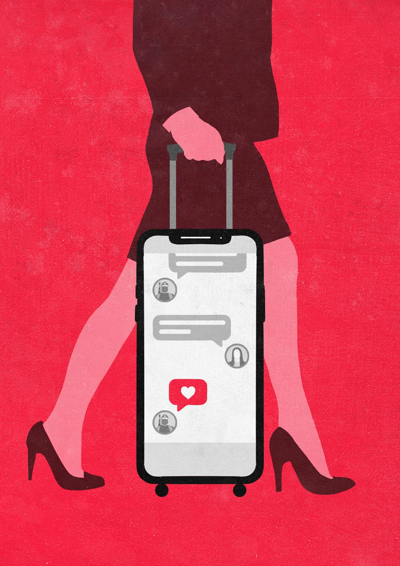
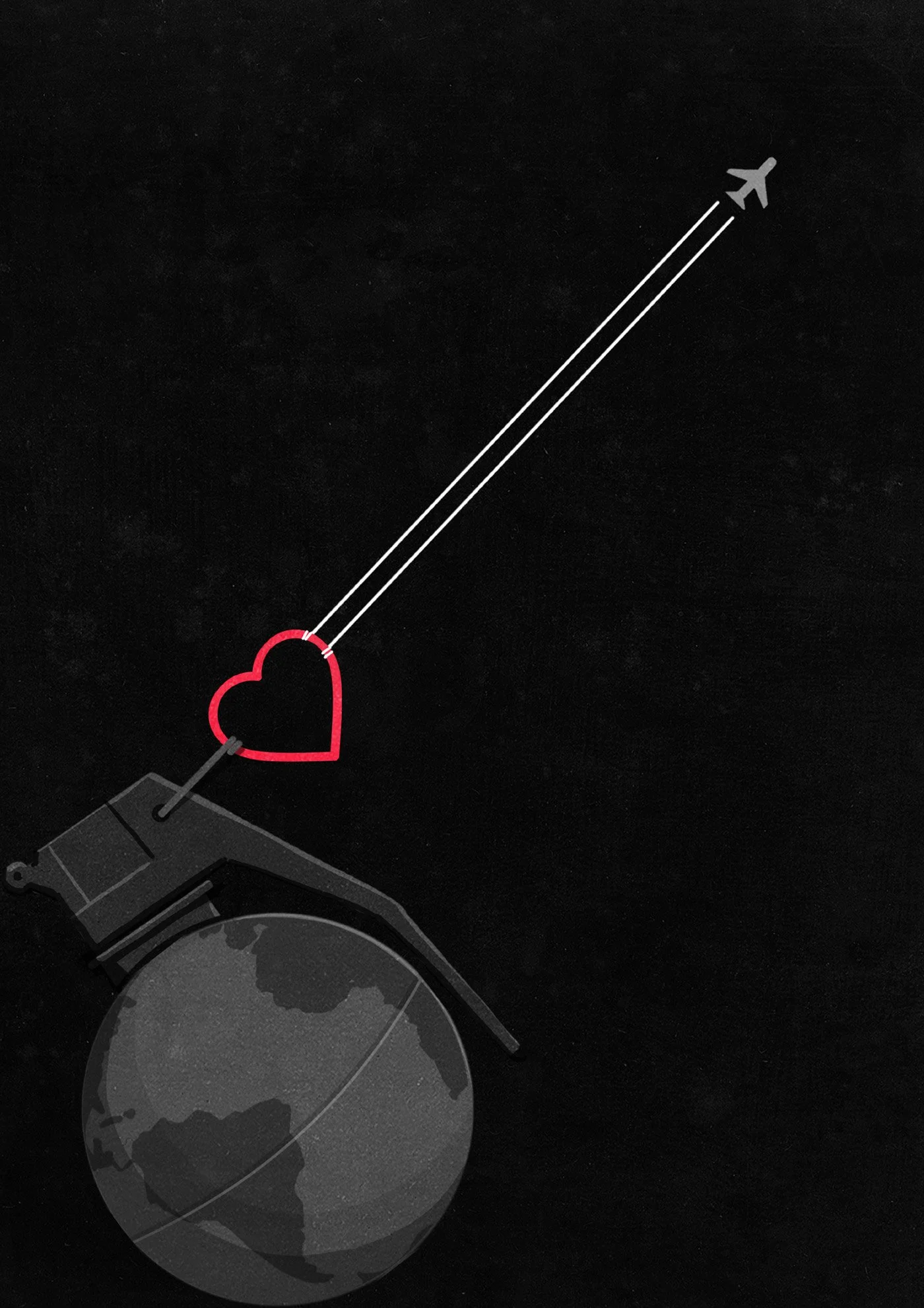
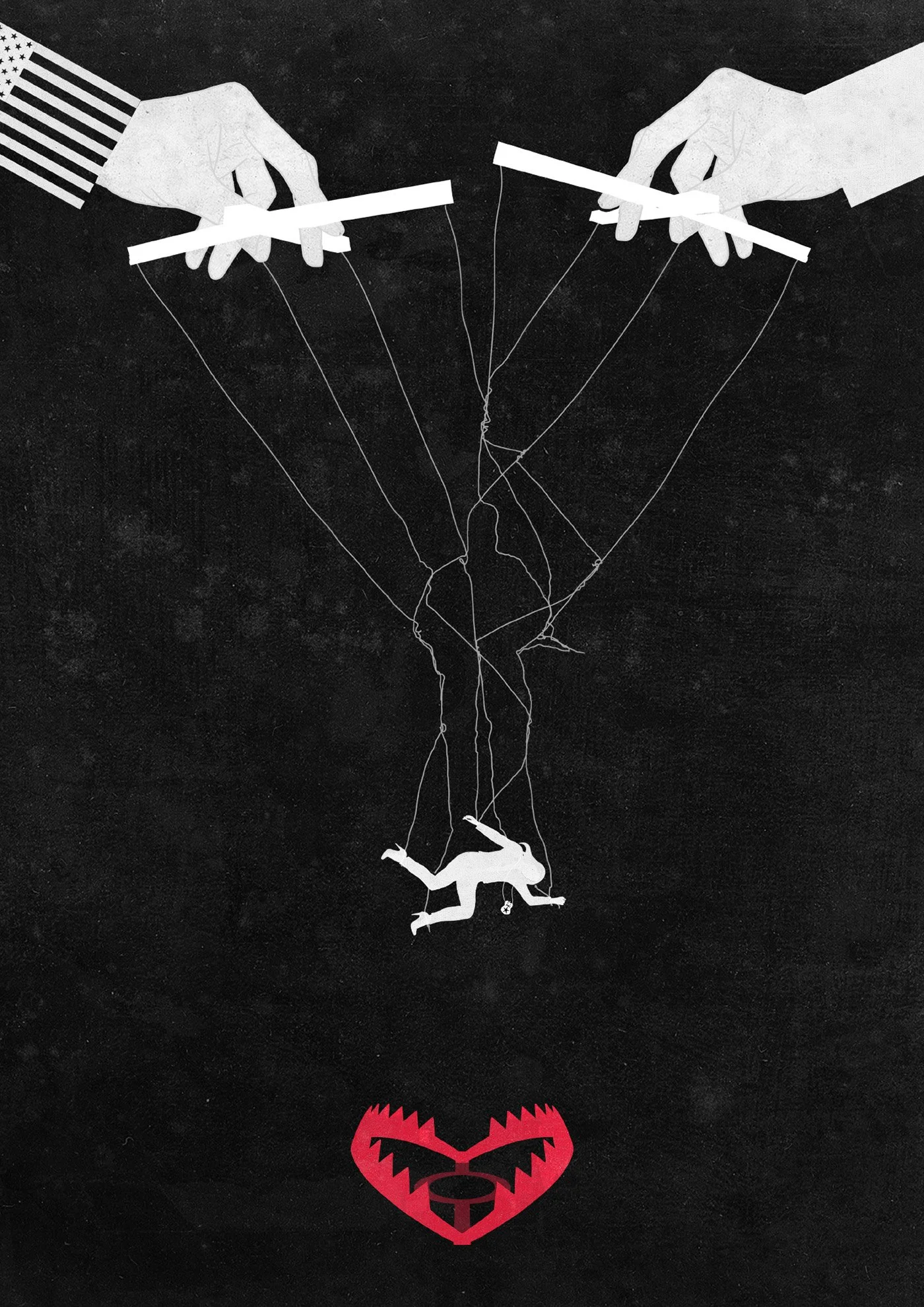
B) The Honey Trap
Here the focus is on temptation, seduction, and manipulation—love as a trap. The visual language revolves around lures, webs, bait, and snares, echoing the real-life tactics used by both sides in the story. Whether through technology, ideology, or human weakness, the danger lies in how love and attention are weaponized—often with fatal consequences.
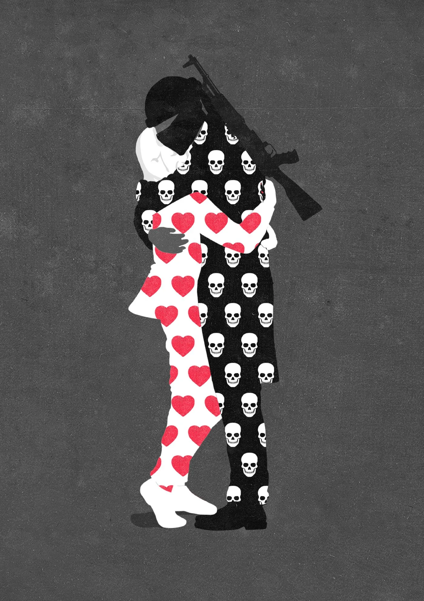
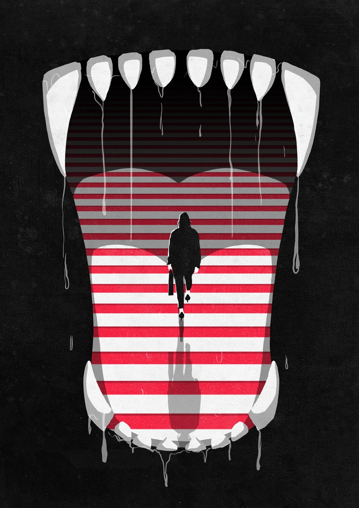
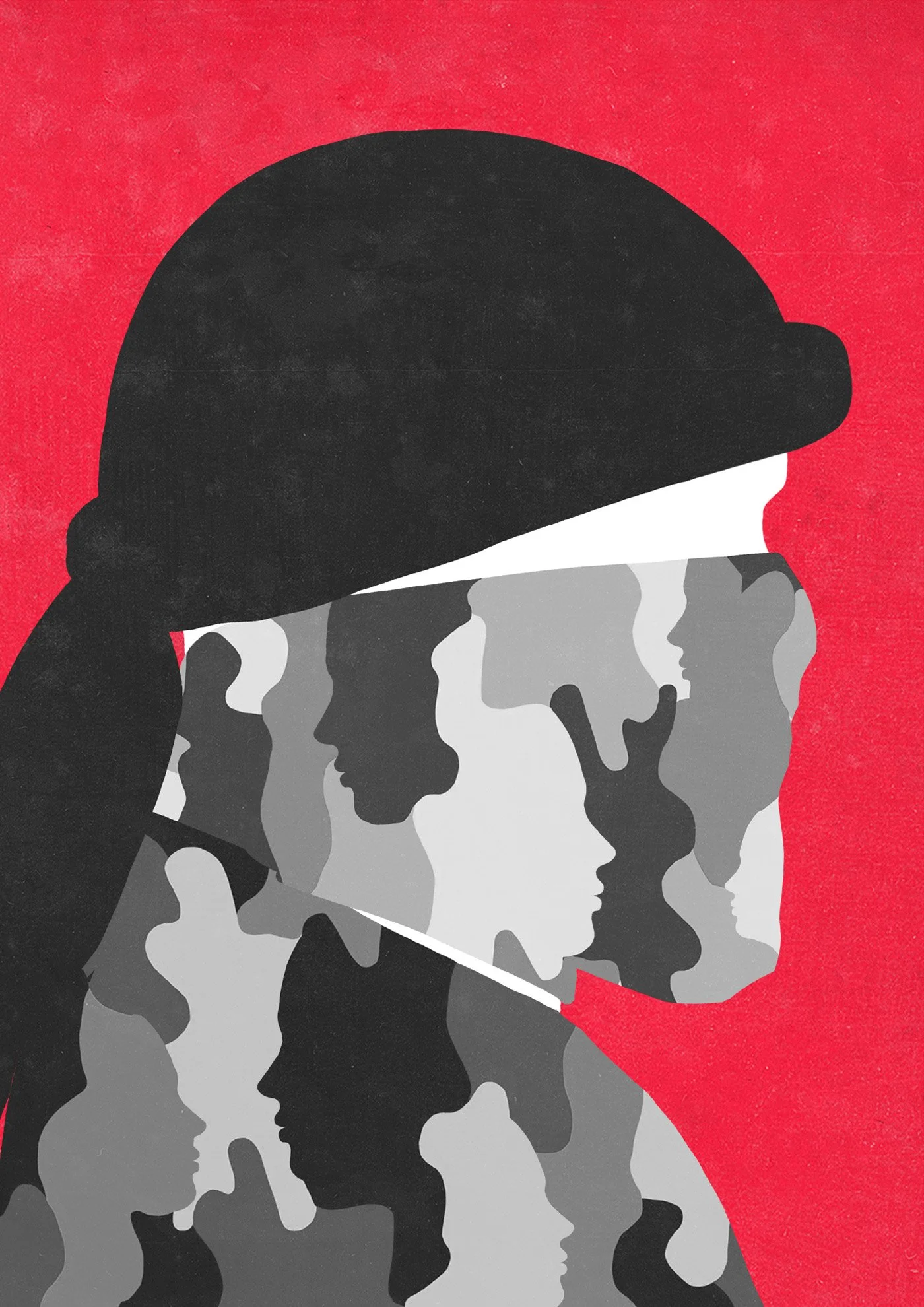
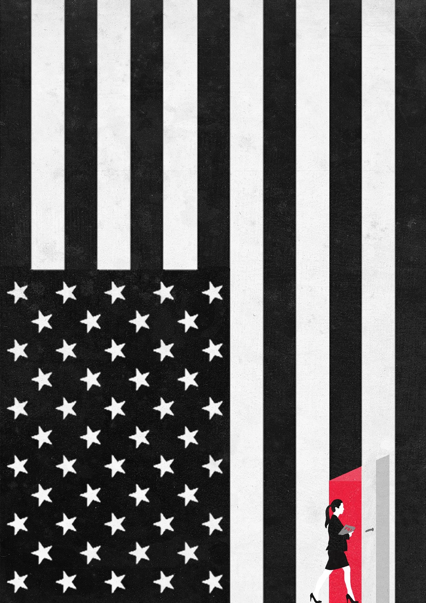
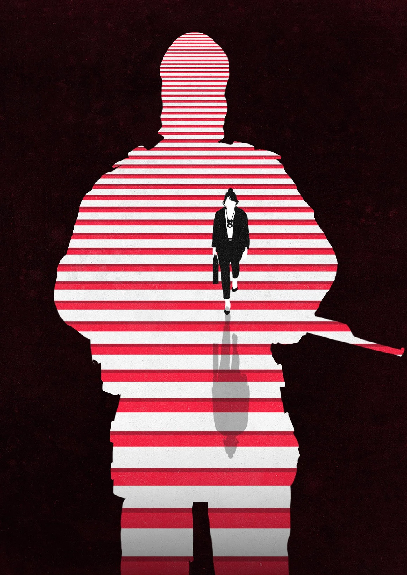
C) Traitors for Love
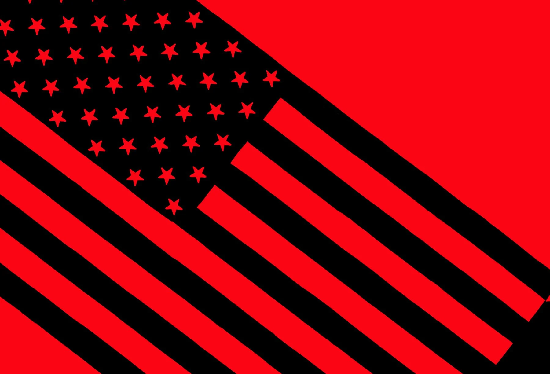
In this direction, the couple’s love is placed front and center—but at a terrible cost. Both are portrayed as crossing a line: she betrays her country, her duty; he betrays the brutal death cult he promised to serve. The visuals speak of camouflage, hidden dangers, seduction, and irreversible choices. Stripes, fangs, and symbols of war and nationalism show how personal love becomes an act of treason in a ruthless, polarized world.
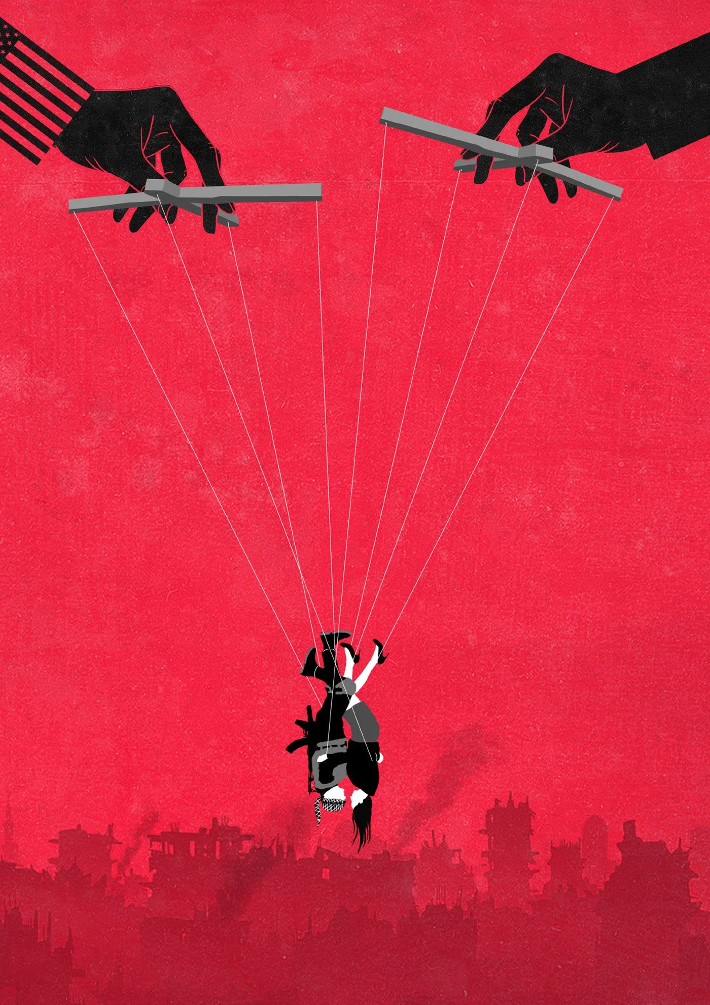
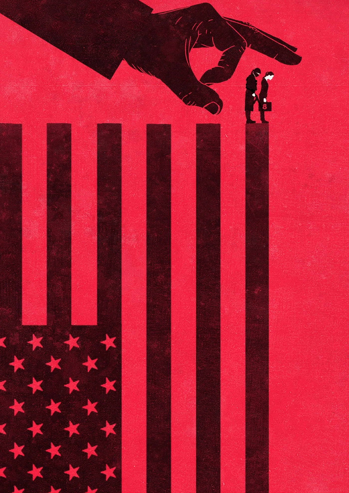
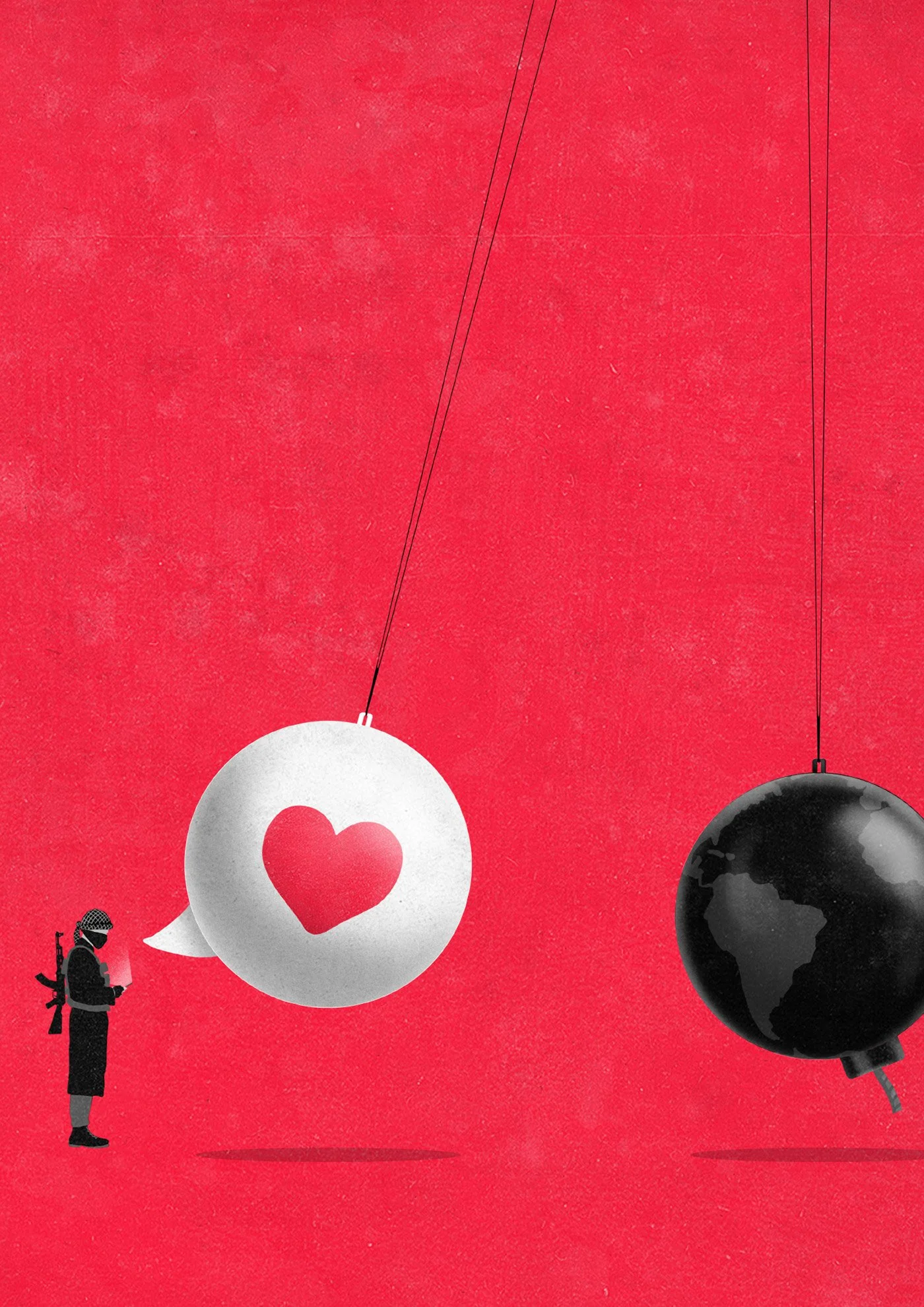
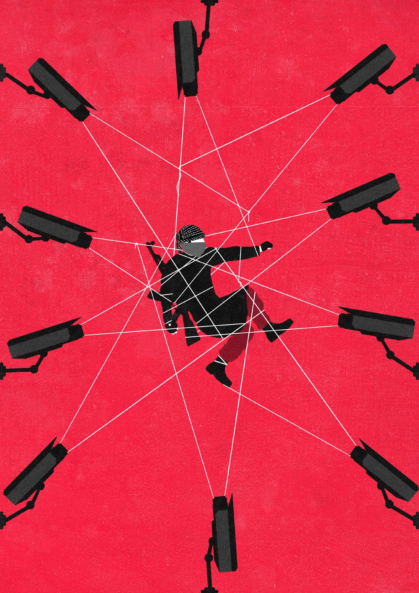
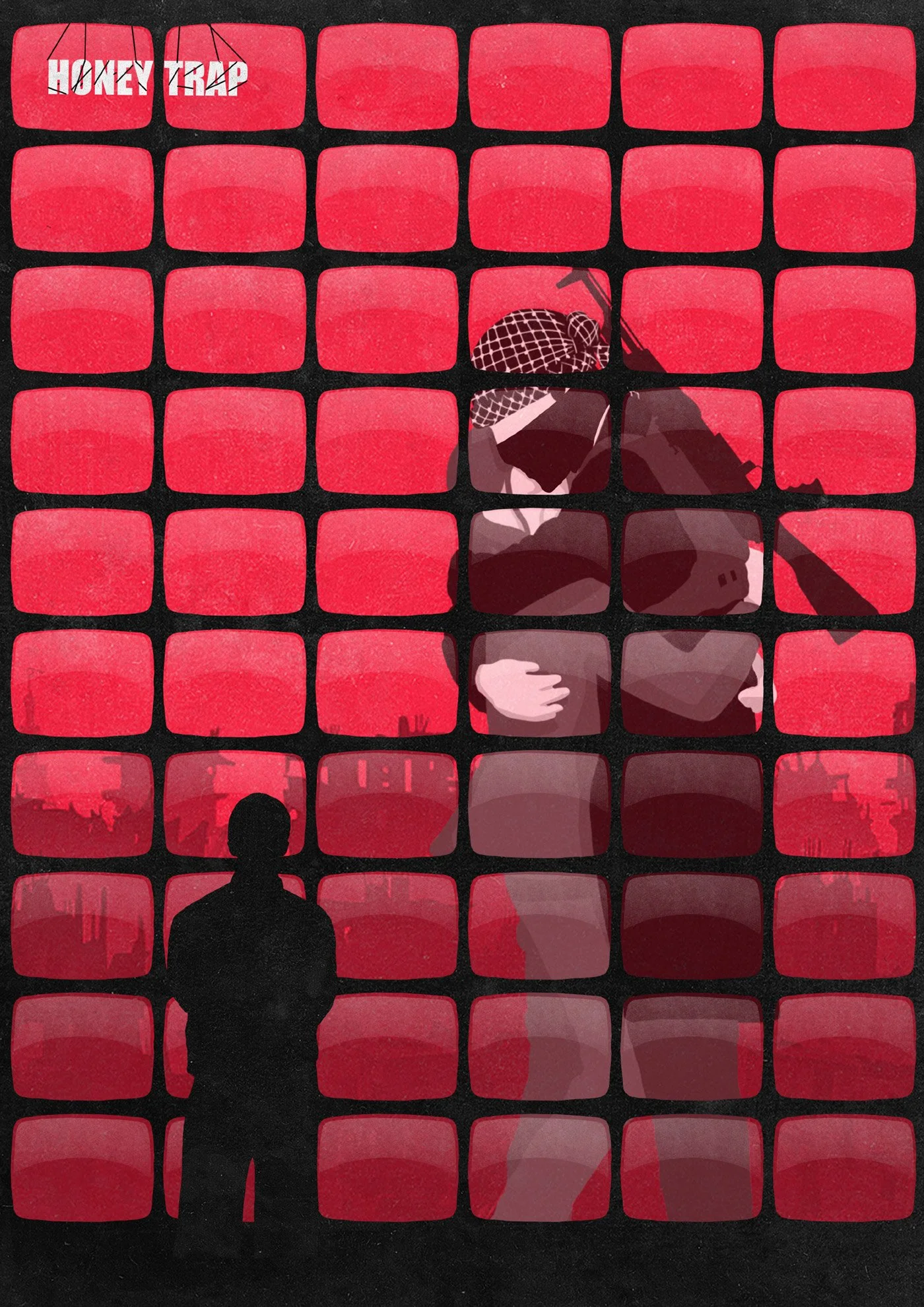
D) A Game of Espionage
Surveillance takes the lead. The focus shifts to the observing third party—the intelligence services—watching and analyzing every move of the unlikely lovers. Their personal story unfolds under a cold, analytical gaze and their love story becomes a strategic game.
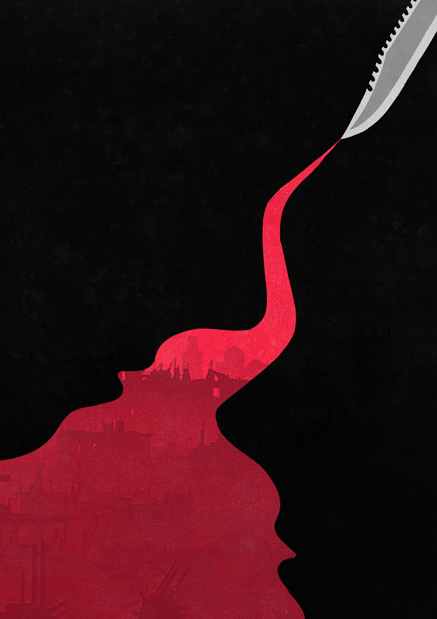
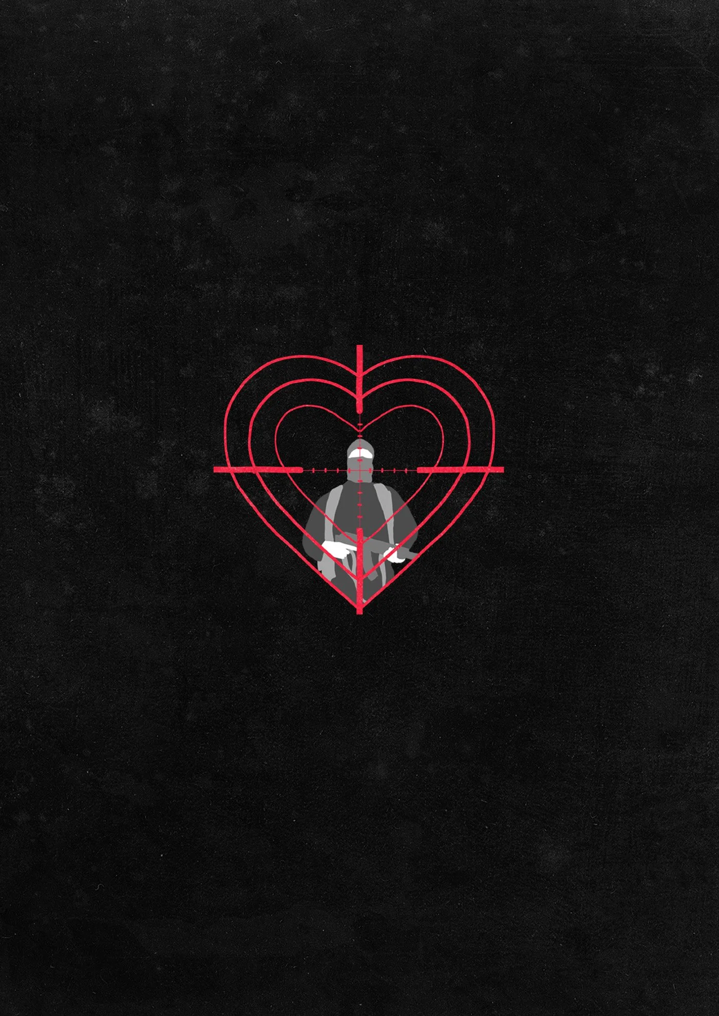
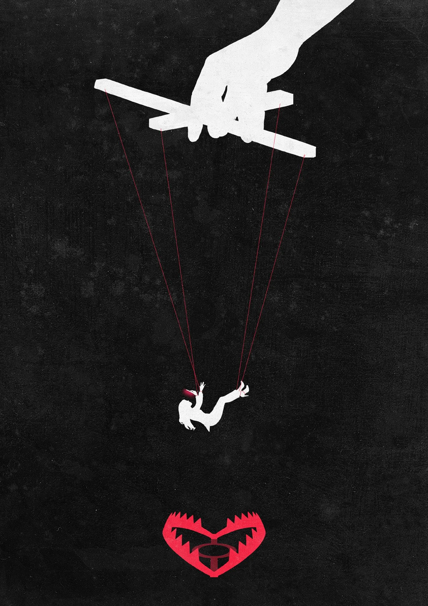
Black Editions
In this series, I explored an alternate, more reduced visual approach—shifting the focus to stark silhouettes, using red as a sharp accent to guide the eye and enhance tension. It wasn’t about developing new ideas here, but about testing whether the overall atmosphere could be intensified through minimalism, abstraction, and contrast.
Step 3: Selecting the Final Concept
At this decisive stage, the team chose the winning concept. From here, the process shifted into the detailed refinement phase—polishing the composition, visual balance, and emotional impact to craft the strongest possible final key artwork.
Step 4: Final Refinements
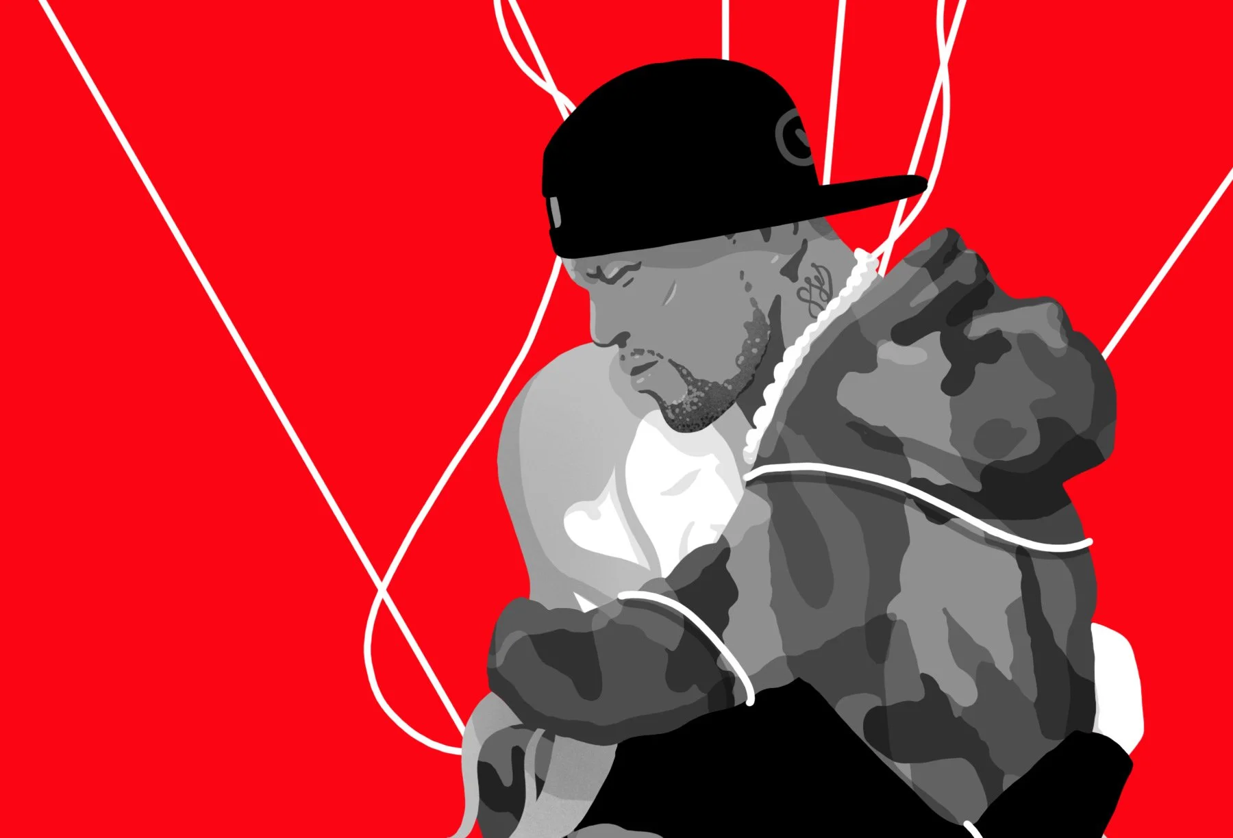
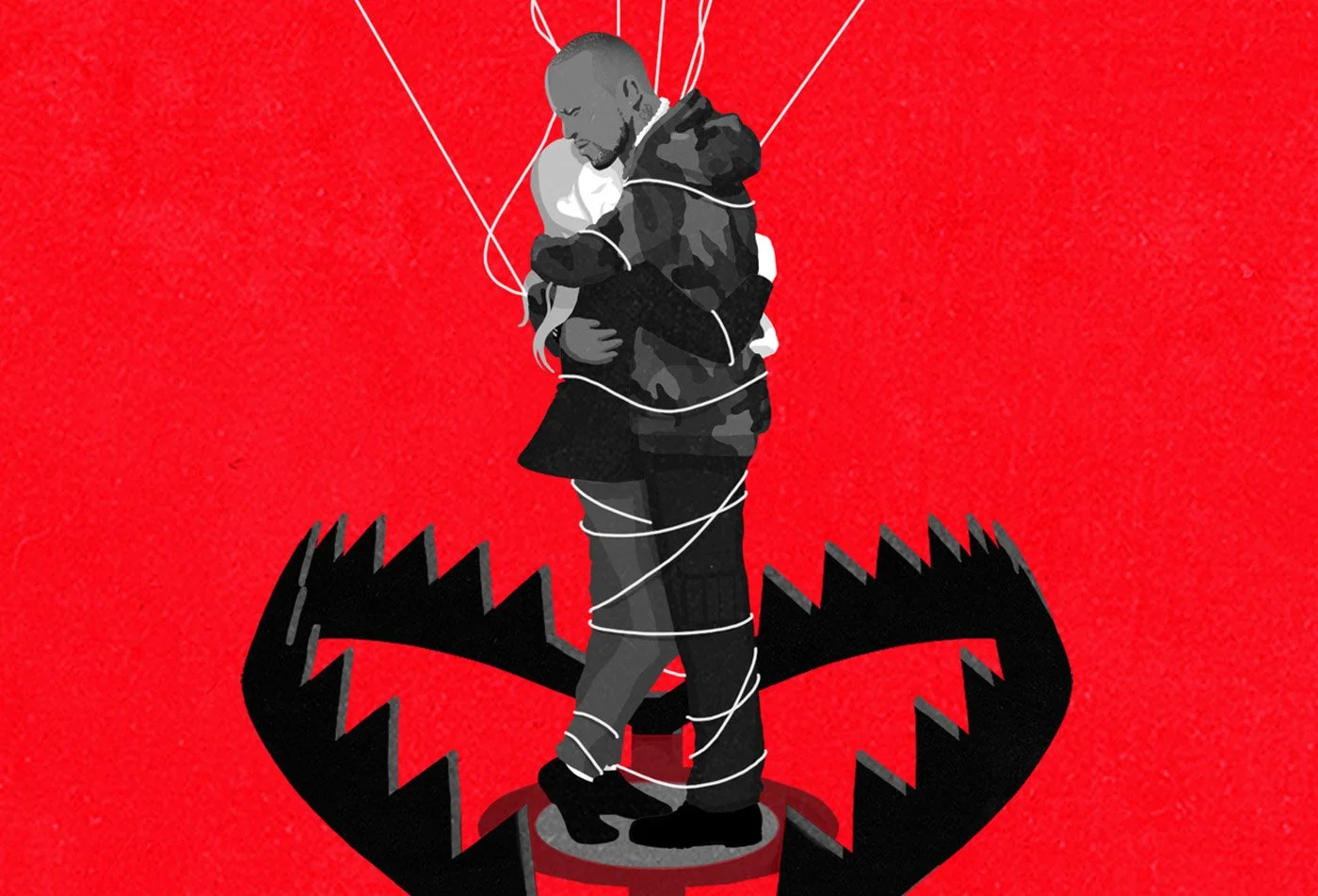
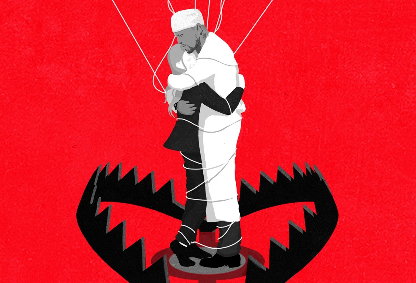
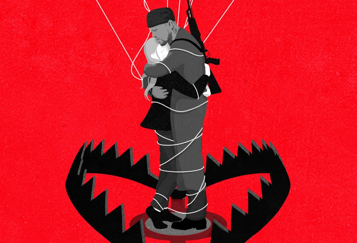
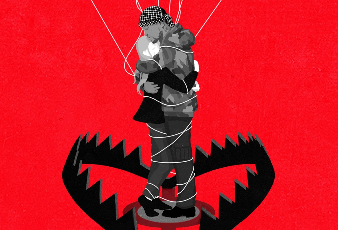
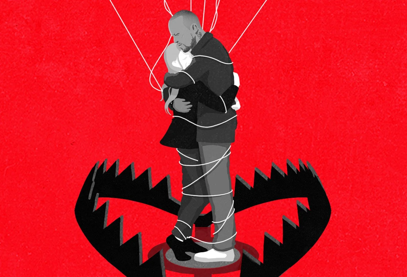
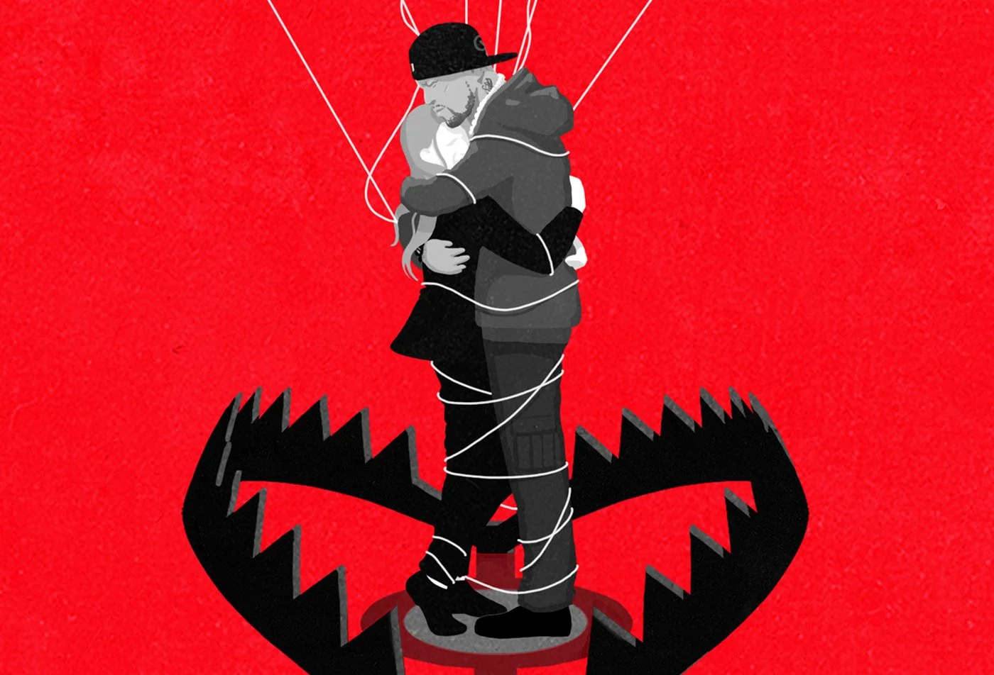
After selecting the final motif, it was all about subtle tweaks, refinements, and fine adjustments. The two protagonists in the image required particular attention—balancing contrast, refining facial expressions, and carefully choosing visible attributes.
The key challenge here: how much to emphasize elements like clothing, religious symbols, or the hip-hop background of the male character—and how to avoid clichés or distractions. At this detailed stage, where every nuance can shift perception, visuals need to be seen, tested, and discussed with the team—to feel their emotional impact and evaluate the final decisions.
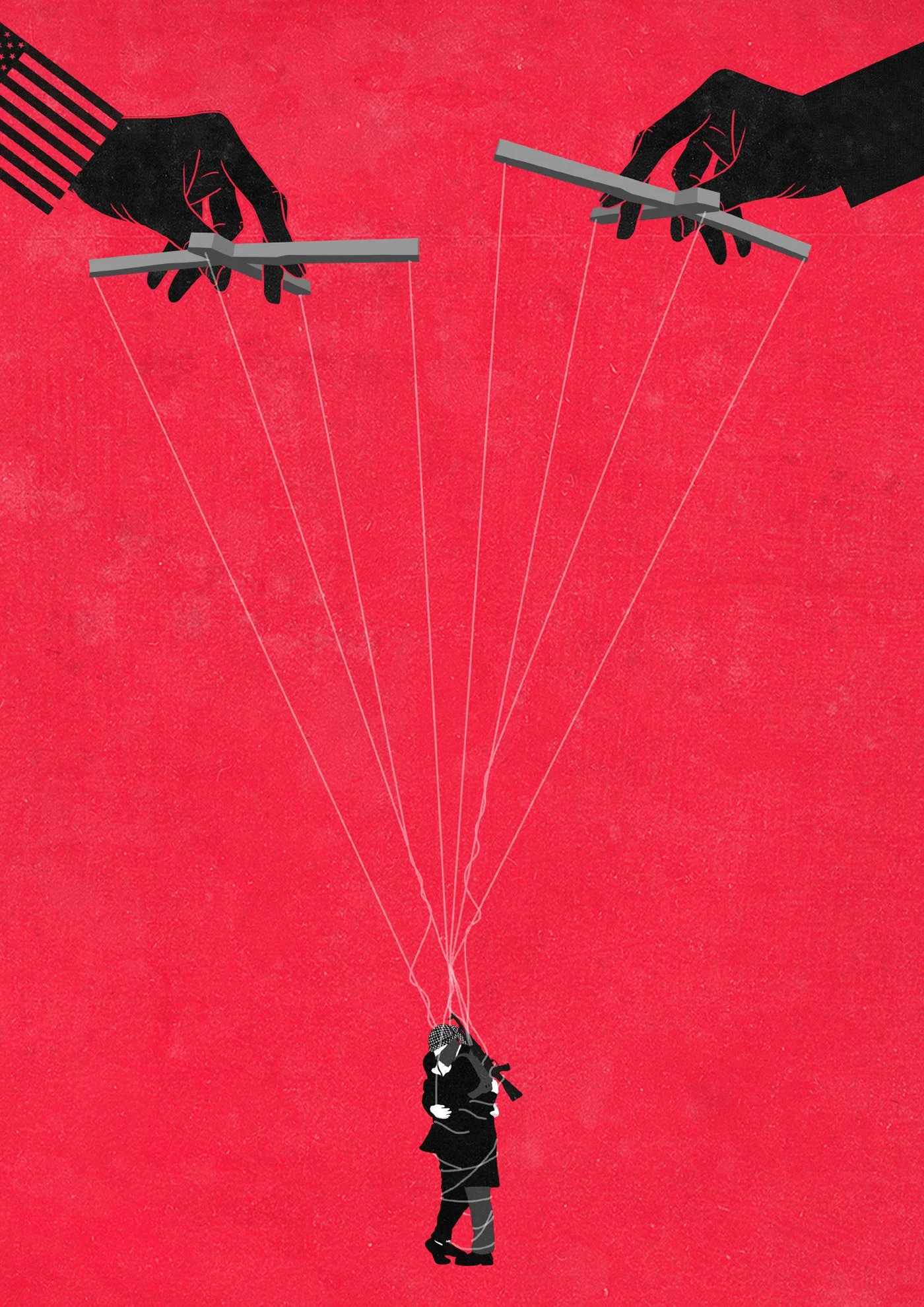
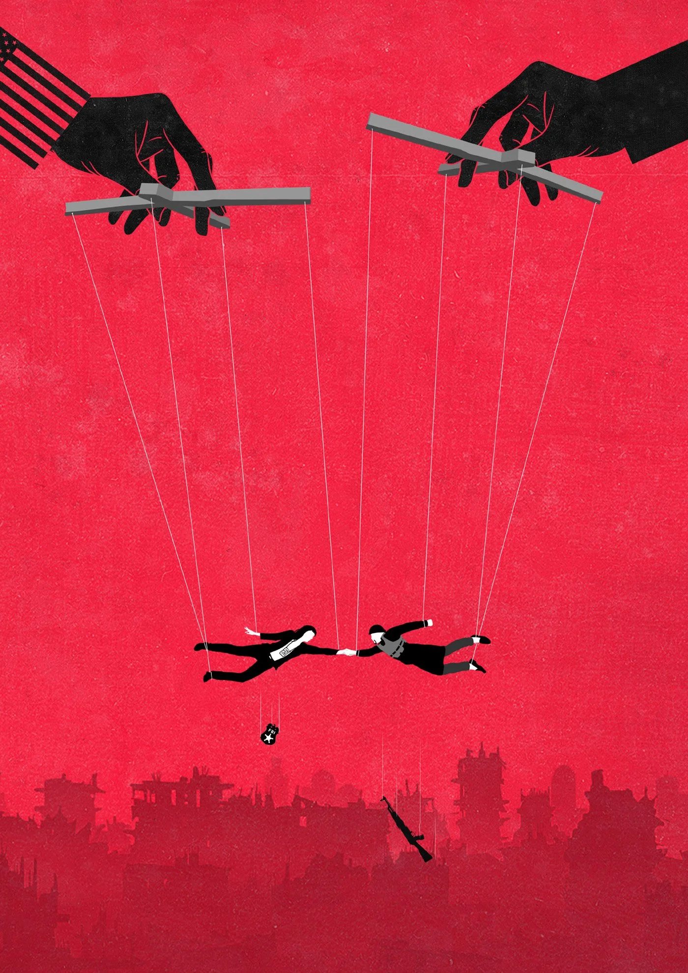
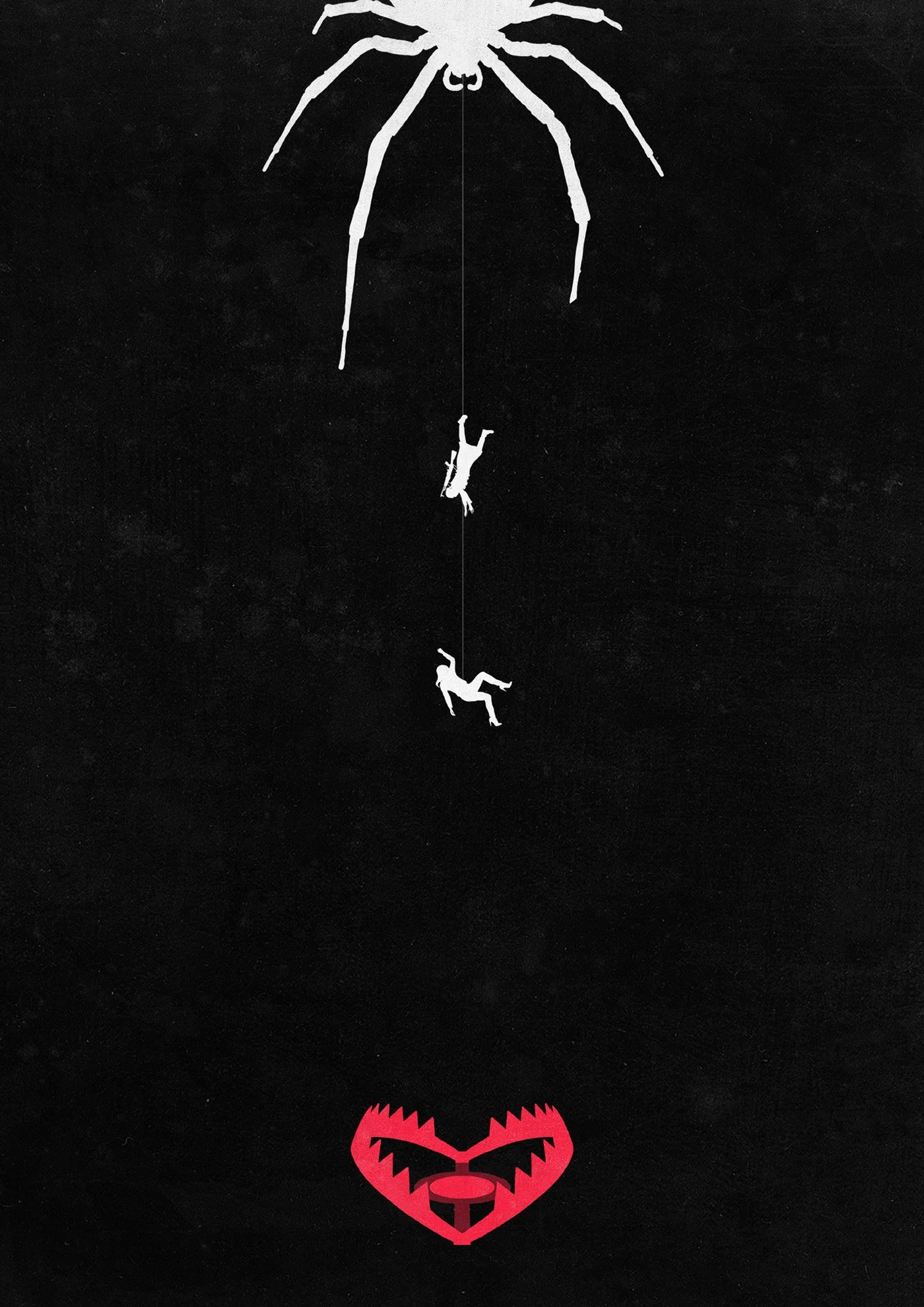
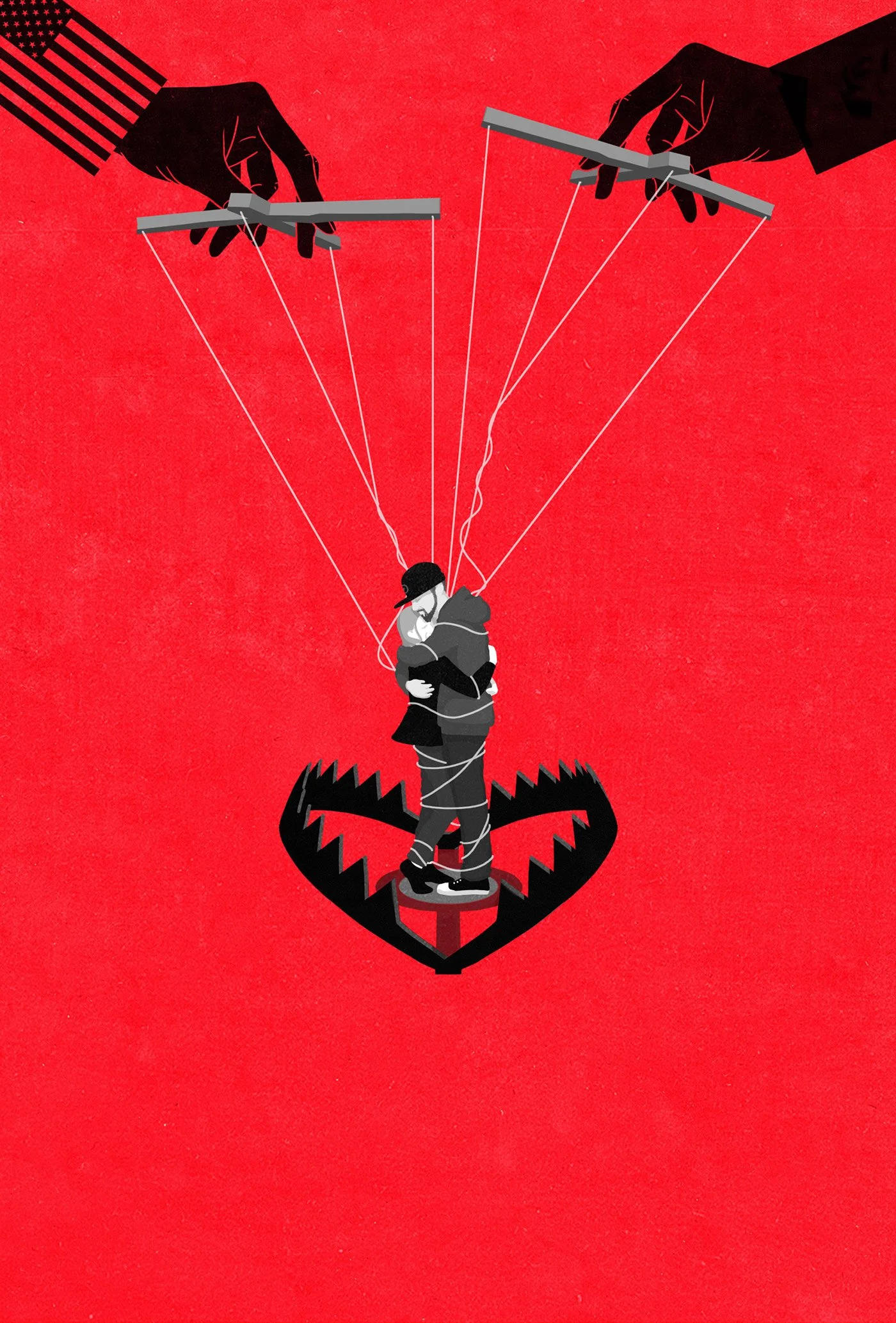
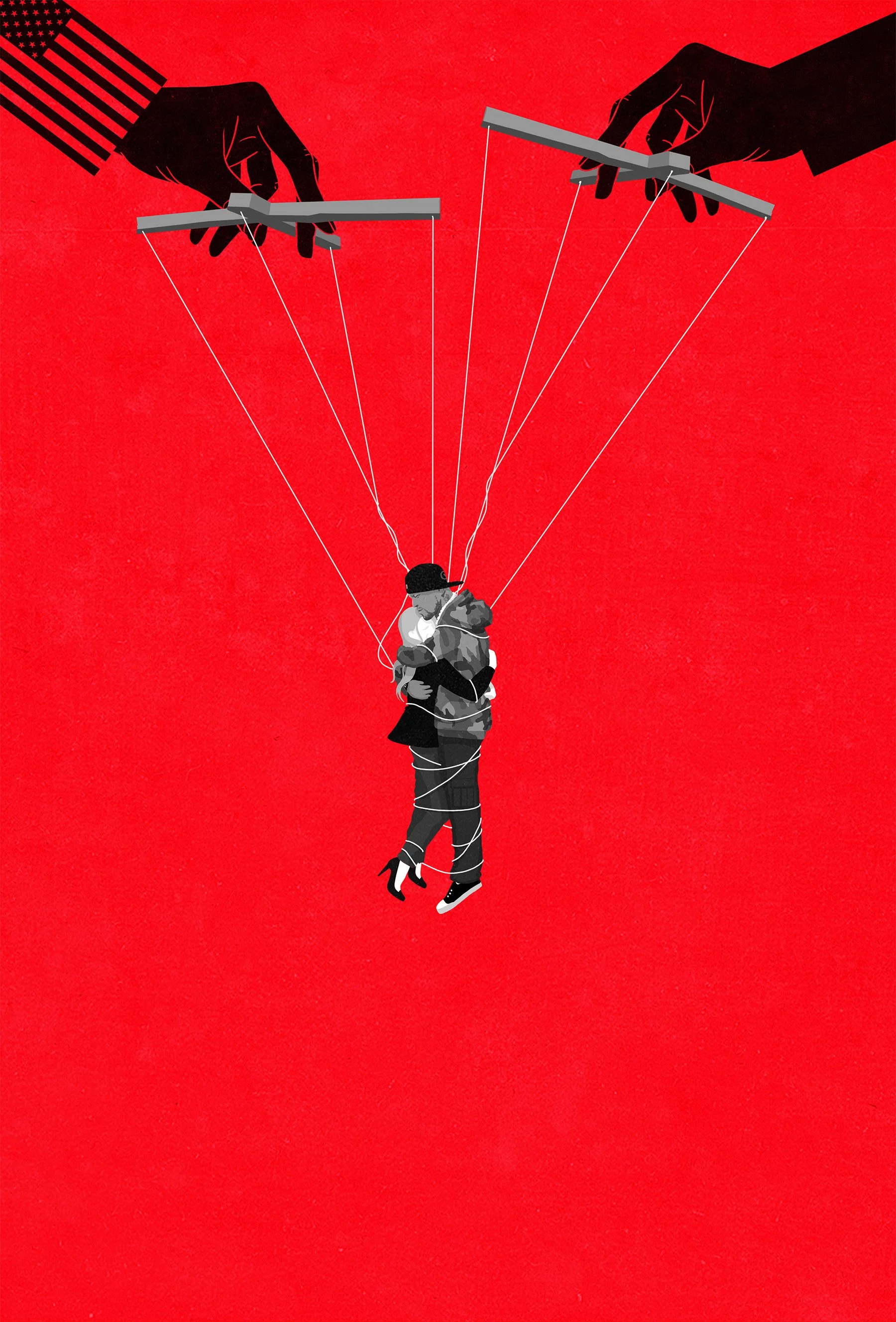
The Final Key Artwork
In the final stage, one last adjustment was made: removing the bear trap. Instead, we let the couple hang entirely from the strings—more exposed, more fragile, and more ambiguous.
This subtle change shifted the focus fully onto their dynamic and the forces controlling them—without anchoring the scene too literally. The result: a striking, minimalist key artwork that became the official cover across Paramount+ channels, social media platforms, and international festivals.
Watch it Now on Paramount+
Looking back, this project brought together everything I love about conceptual illustration: a strong story, big emotions, political relevance—and the creative challenge to distill all that into a single striking visual.
On top of that, creating key art for the movie industry has always been a dream project on my personal bucket list as a freelance illustrator—and it felt great to finally check that box.
It was a pleasure to collaborate with such a clear-sighted creative team, and to be trusted with so much freedom within such a sharp brief.